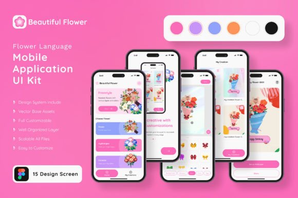
Crafting a Blooming Mobile Experience: The Flower Language UI KIT
Imagine launching a mobile application that feels less like a digital tool and more like a carefully curated botanical garden. Whether you are a wellness entrepreneur launching a meditation app, a florist expanding into e-commerce, or a developer building a dating platform based on romantic gestures, the user interface sets the tone before a single word is read. The challenge, however, lies in the gap between that beautiful vision and the complex reality of coding and design. This is where the DIY Flower Language App Mobile UI KIT steps in, offering a bridge that saves time, reduces costs, and ensures your final product looks professionally polished.
For many creators and business owners, the initial phase of app development is daunting. You might have a clear concept for a floral arrangement service or a poetry journal app, but translating that into a functional, attractive design often requires hiring expensive specialists or spending weeks struggling with layout grids. This template kit removes that friction. It provides 20 high-quality, pixel-perfect screen designs that serve as a robust foundation. Instead of starting with a blank canvas, you begin with a fully realized aesthetic—lush, elegant, and ready to be customized. It allows you to focus on your business logic and content, knowing the visual framework is already taken care of.
More Than Just Screens: A Modular Design System
At its core, the DIY Flower Language App Mobile UI KIT is a modular design system built for flexibility. It consists of over 80 user interface elements and 20 distinct screens, ranging from splash pages and onboarding flows to detailed profile views and e-commerce checkouts. The beauty of this kit lies in its "plug-and-play" nature. You are not locked into a rigid structure. Because the files are fully layered and utilize vector shapes, you have complete control to add or subtract elements as your project demands.
Let’s say you love the navigation bar from one template but prefer the color palette of another. Because the kit is built with 100% vector layers and symbol objects, mixing and matching these components is seamless. This is particularly vital for those working in Adobe Photoshop, Adobe InDesign, or Sketch. The compatibility across these industry-standard platforms means you don’t have to learn new software or compromise on your preferred workflow. You can resize elements without losing quality, ensuring your app looks crisp on everything from a small smartphone to a large tablet screen.
The Aesthetic of Botanical Elegance
Visual communication is often about emotion, and the floral aesthetic of this kit evokes feelings of growth, romance, and organic simplicity. This makes it an incredibly versatile asset for a wide range of industries beyond just gardening. The design style leans into modern typography and clean layouts, ensuring that while the theme is botanical, the execution remains sleek and contemporary.
Consider the power of brand identity. If you are a small business owner selling artisanal soaps or handmade jewelry, your mobile presence needs to reflect the care you put into your products. A generic, sterile app interface can undermine that trust. By utilizing the DIY Flower Language App Mobile UI KIT, you align your digital presence with the natural, high-quality nature of your goods. The included free fonts and free icon vectors further enhance this, providing a cohesive visual language right out of the box. The icons are designed to match the floral theme, adding subtle touches of personality to functional elements like "Add to Cart" or "User Profile."
Practical Applications for Entrepreneurs and Creators
The utility of this kit extends far beyond the initial app launch. Because the assets are 100% scalable vectors and fully editable, they become a long-term resource for your marketing assets. You can repurpose the screen designs to create mockups for investor pitches, social media advertisements, or website banners.
Here are a few practical ways to leverage this template in your daily workflow:
- Prototyping and Pitching: If you are an entrepreneur seeking funding, a clickable prototype is worth a thousand words. Use the 20 screens to map out your user journey and present a polished visual to stakeholders.
- Social Media Content: The high-quality design elements can be extracted and used to create cohesive social media graphics. You can use the floral frames and UI elements to design Instagram stories or Pinterest pins that drive traffic to your app.
- Web Design Consistency: Maintaining a consistent look across your mobile app and desktop website is crucial. You can use the color schemes and layout logic from the kit to inform your web design, ensuring a seamless brand experience.
- Print Materials: Don't limit these digital assets to screens. The vector nature of the kit means you can print these designs at high resolution for packaging design, posters, or invitations for a launch event.
Customization: Making the Template Your Own
A common fear with using templates is the risk of looking generic. However, the DIY Flower Language App Mobile UI KIT is designed specifically to be a starting point, not the final destination. The instruction that it is "easy to change color style" is a significant advantage for branding. If your brand colors are navy and gold rather than soft pinks and greens, you can globally adjust the color palettes in just a few clicks.
Furthermore, the ability to edit the typography allows you to infuse your specific voice. While the kit includes free fonts, you can swap them out for a premium font or a specific script font that better matches your brand’s personality. Whether you need a bold sans serif font for clarity or a delicate serif font for tradition, the fully layered structure accommodates these changes without breaking the layout. This adaptability is what transforms a generic template into a unique brand identity.
Technical Reliability and Efficiency
For designers and developers, efficiency is currency. The DIY Flower Language App Mobile UI KIT is built with technical precision to save you billable hours. The use of symbol objects in Sketch and Adobe XD means that if you change a button style on one screen, it updates across the entire project. This ensures visual consistency and drastically reduces the time spent on revisions.
Moreover, the kit includes over 80 UI elements—buttons, toggles, sliders, and inputs—that have already been tested for visual balance. You don't need to guess the proper padding for a text field or the ideal size for a call-to-action button; the heavy lifting has been done. This allows you to focus on user experience (UX) strategy rather than getting bogged down in pixel-pushing.
By providing a comprehensive set of design assets in formats like Adobe Photoshop and Sketch, this kit democratizes high-end design. It empowers hobbyists and small business owners to create professional-grade mobile applications without a steep learning curve. It is a toolkit that respects your time, understands the need for aesthetic beauty, and provides the technical flexibility required to bring a unique digital vision to life.